| Administrator Handbook | Table of contents |
|
Introduction
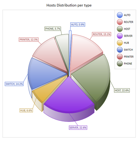
The statistical data charts of LoriotPro visually display the summary information on the operating state and sizing of your network and systems. The charts can be displayed on demand or automatically with the Dashboard Player and allowing the network administrator to monitor at a glance and in real time the overall state of its infrastructure.
This document explains how to change the graphics configuration settings in the generation file of these graphics. These files can be used as is or serve as a model (template) and be customized.
Models for Dashboard Player slideshows are LUA files.
They are located absolutely in the /bin/config/script/httpdashboard/ so that the Dashboard Player can list them in its interface.
Chart Terminology
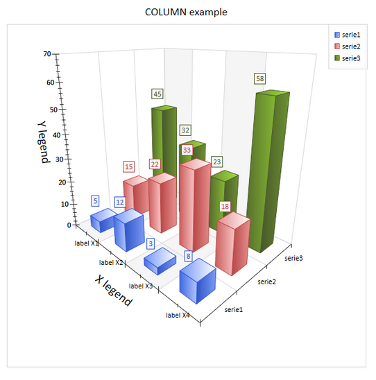
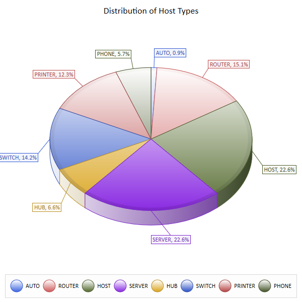
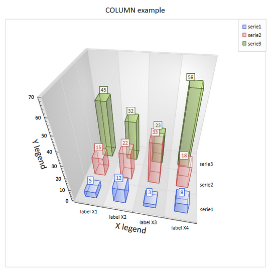
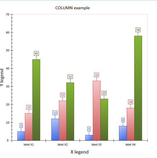
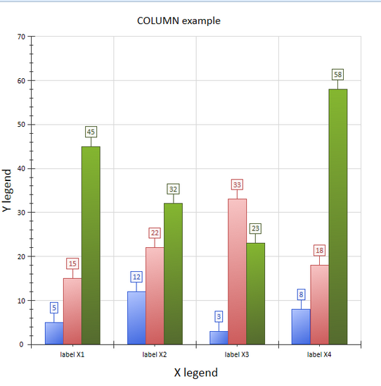
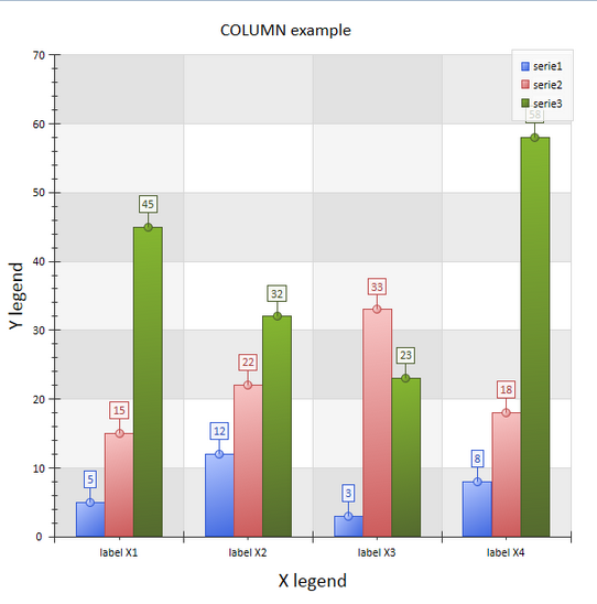
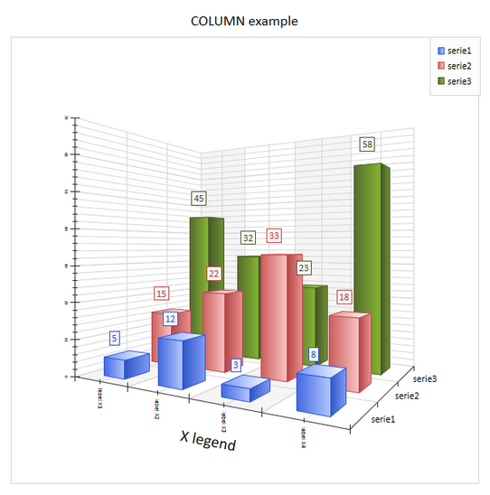
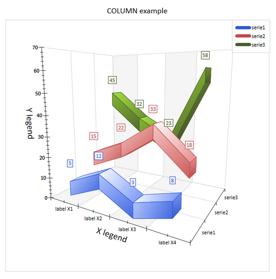
To control the settings of the graphics, we must tame the related terminology. Here is a sample of a chart column with most options enabled. It displays three series of data each having in the graphic its own color.
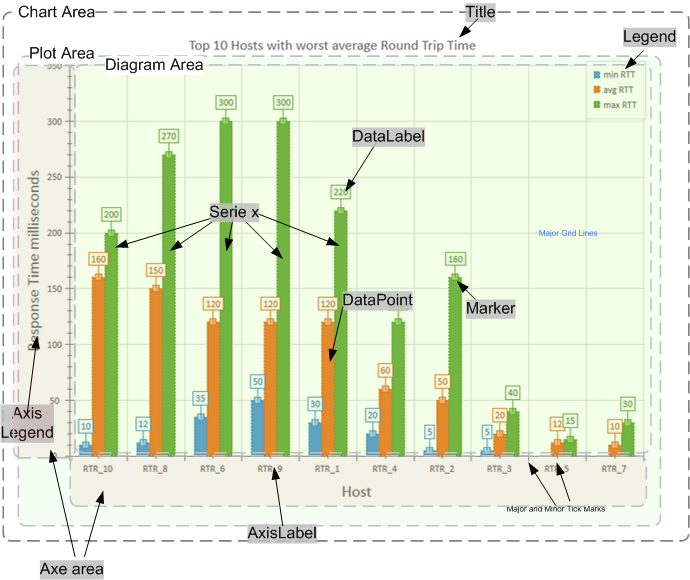
Chart Area. All other elements are located within Chart Area.
Title. The chart title is usually located at the top of Chart Area.
Legend. A Legend displays a list of series names or data points along with their keys. A Legend may be aligned at the left, top, right, bottom and top-right positions of the Chart Area. It may also overlap the Plot Area.
Plot Area. The Plot Area contains Chart Axes and Diagram Area.
Chart Axes. Axe of the chart, X, Y and Z for 3D. Axes have the following properties:
Diagram Area. The Diagram Area displays Series.
Series. A Series is built up from a list of Data Points.
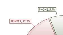
Data Point. A data point is a simplest entity that can be shown on Diagram. Its appearance depends on Diagram type (later - Chart Type). For example, for the Pie chart a data point is displayed as a pie portion, but for the Bar chart - as a rectangle. A Data Point can be marked on the Diagram by Data Marker and annotated by Data Label.
Configuration parameters of statistical data charts
In the LUA script file, a set of parameters are used to customize the displayed chart.
Serie(s) of the statistical data
Global parameters of visual aspect
Specific parameters for the PIE chart
Specific parameters for the DOUGHNUT and TORUS chart
Specific parameters for the LINE chart
Specific parameters for the: BAR, COLUMN chart
Serie(s) of the statistical data charts
| chart.Label | Series of data points to be displayed in chart. Must be defined in a LUA table with a syntax that complies strictly. La table LUA is a set of one entry for each DataPoint with the following format: SerieName;Label_Axe_X;value
The color of the Data Point can be assigned individually by the following syntax: : Nom_de_la serie;Label_Axe_X;valeur;COLOR;index COLOR is a reserved keyword index is the number of the color in the theme |
Global parameters of visual aspect
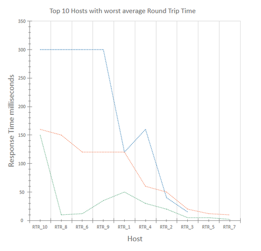
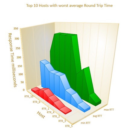
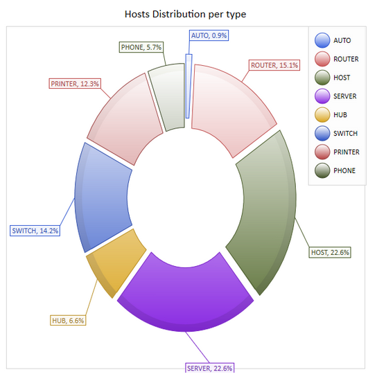
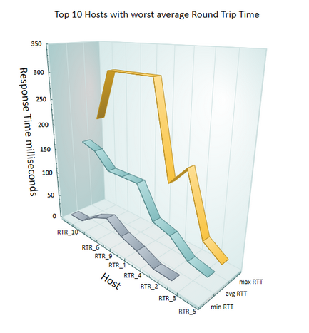
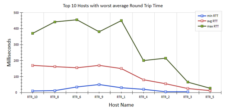
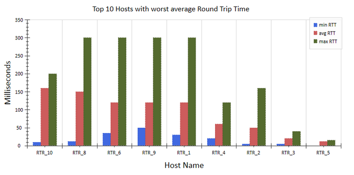
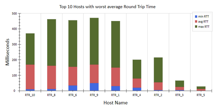
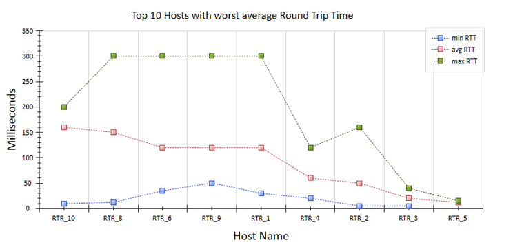
| chart.ChartTitle | Chart title displayed above (eg "Top 10 Host with worst response time" |
|||||||||||||||||||||||||||||||||||||||||||||||||||||||||||||
| chart.Width | width of the graphic in pixel |
|||||||||||||||||||||||||||||||||||||||||||||||||||||||||||||
| chart.Height | Height of the graphic in pixel By default, this value is set depending on the size of the window with the variable lp_Height |
|||||||||||||||||||||||||||||||||||||||||||||||||||||||||||||
| chart.Category | Category of graphique 0: Default; |
|
||||||||||||||||||||||||||||||||||||||||||||||||||||||||||||
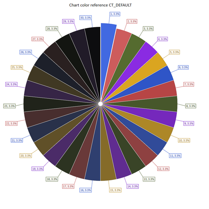
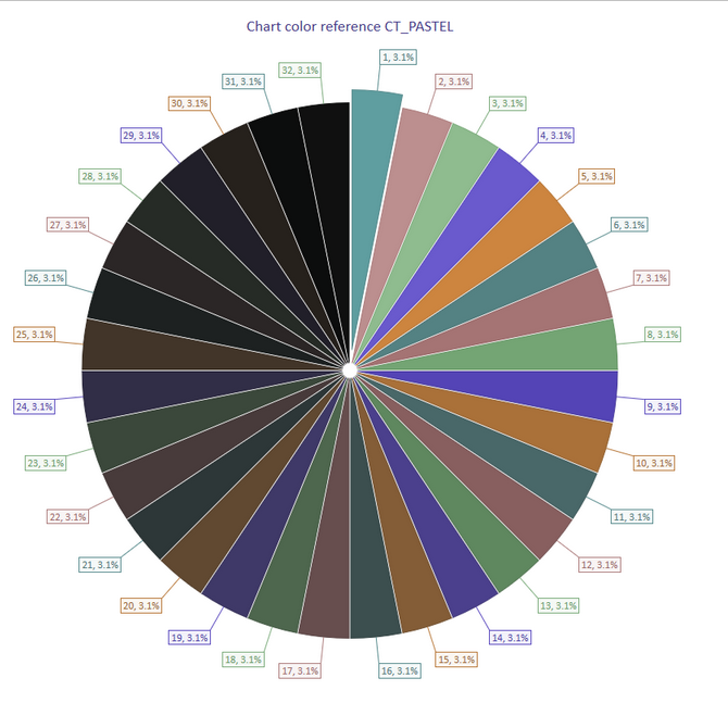
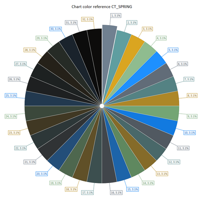
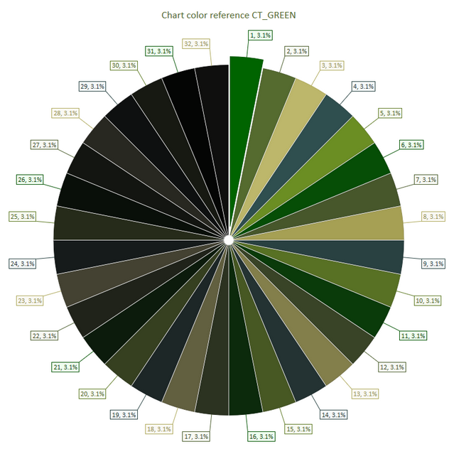
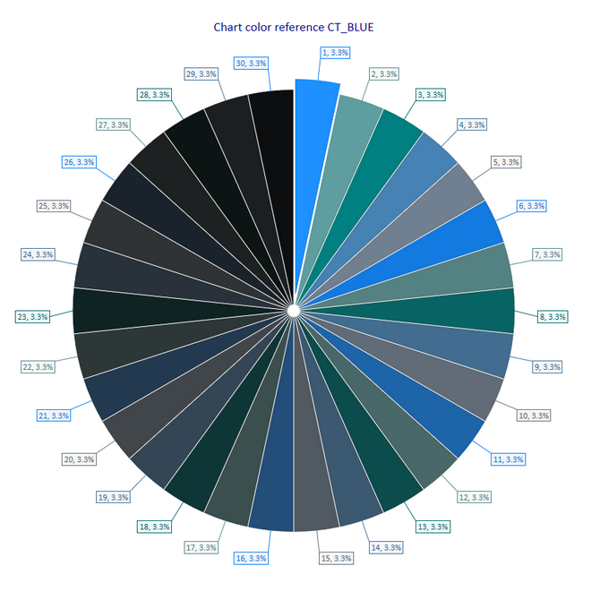
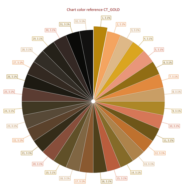
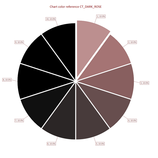
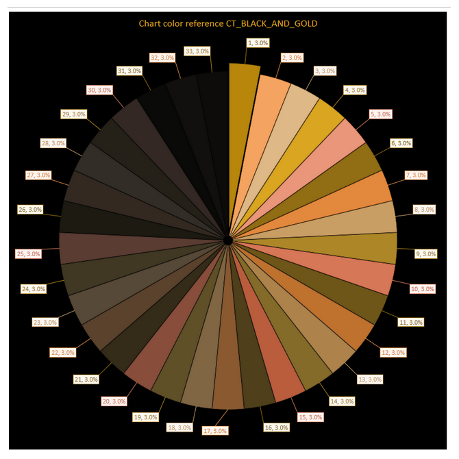
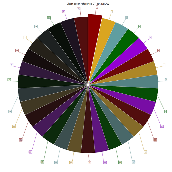
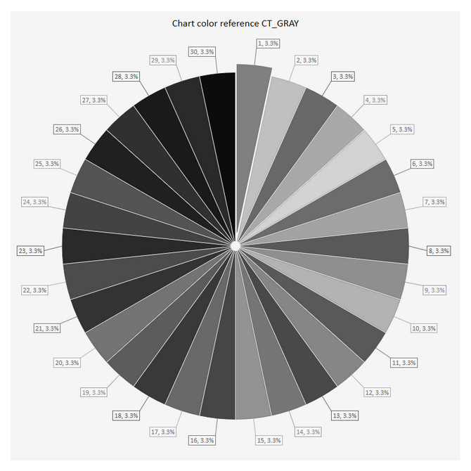
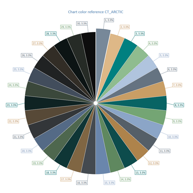
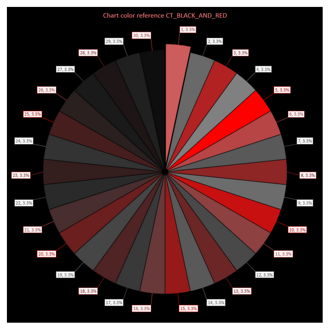
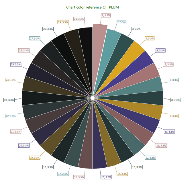
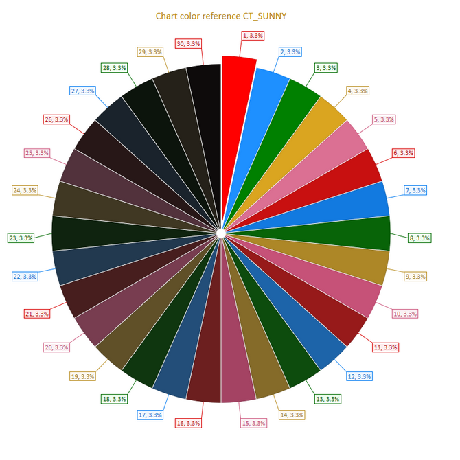
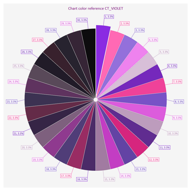
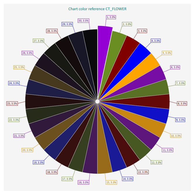
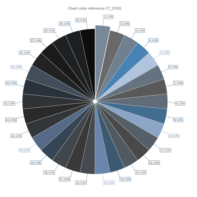
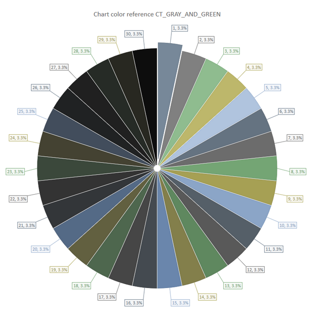
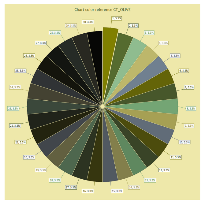
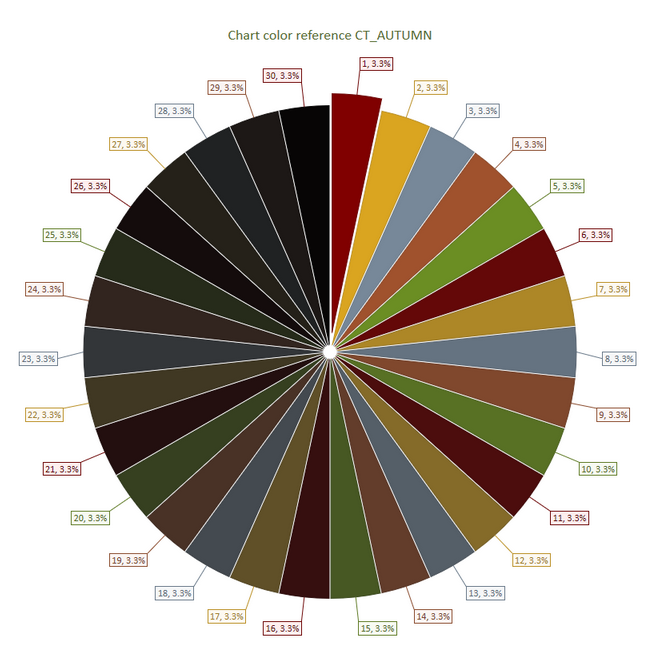
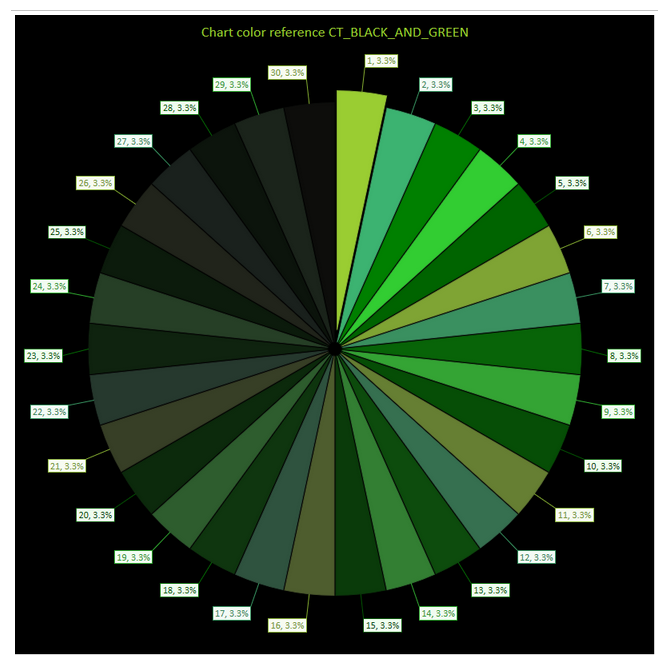
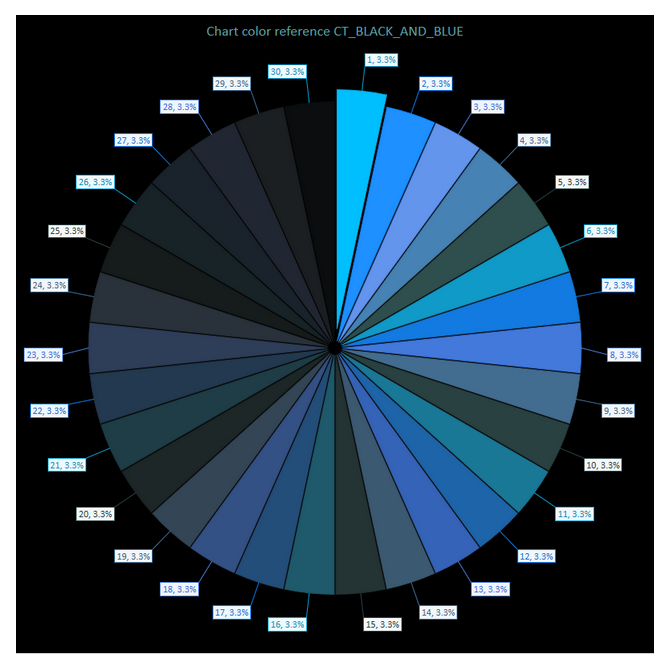
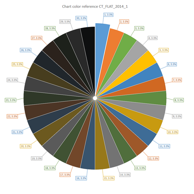
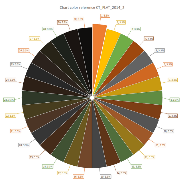
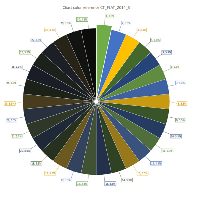
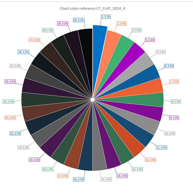
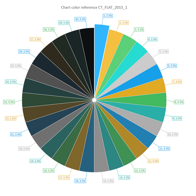
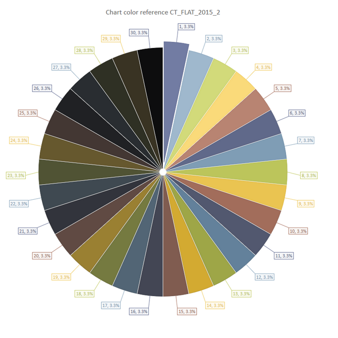
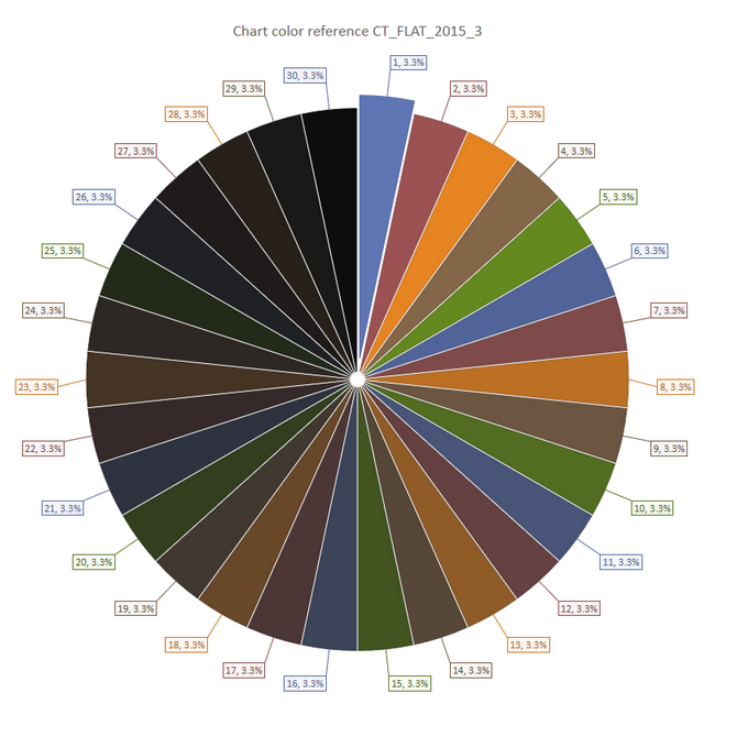
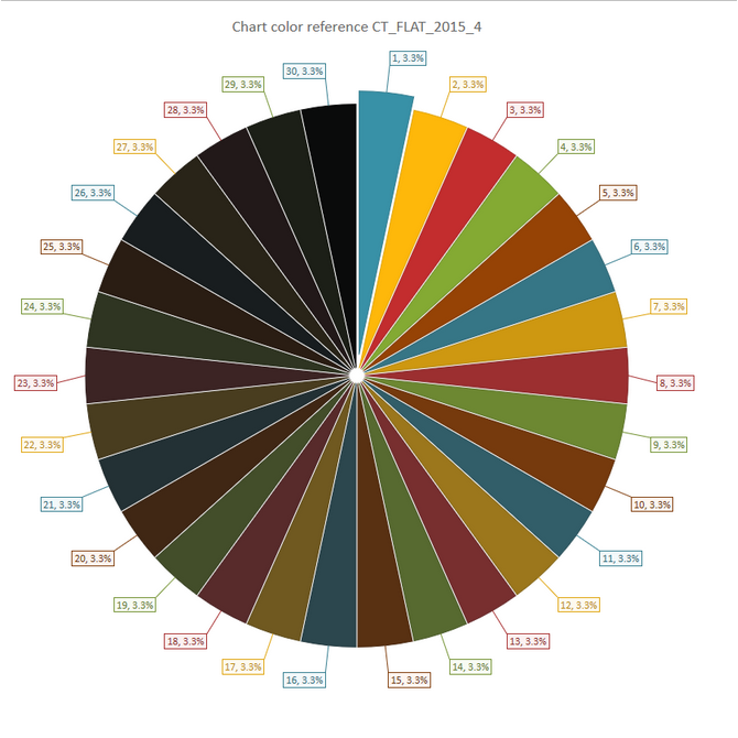
| chart.ChartTheme | Color theme of the serie. Example here are reduced, click on this link Selection of the color theme to have a full view. -- 0: CT_DEFAULT |
|
||||||||||||||||||||||||||||||||||||||||||||||||||||||||||||
| chart.CustomColor | 0 - Do not use custom color If Option 1 is selected to be defined 5 colors available (limited to 5 sets of data) example --chart.Serie_SetColorS0=BCGPColor["LavenderBlush"] Available colors are defined in the following table LUA: BCGPColor={ |
|||||||||||||||||||||||||||||||||||||||||||||||||||||||||||||
| chart.Serie_SetColorS1 | see chart.CustomColor | |||||||||||||||||||||||||||||||||||||||||||||||||||||||||||||
| chart.Serie_SetColorS2 | see chart.CustomColor | |||||||||||||||||||||||||||||||||||||||||||||||||||||||||||||
| chart.Serie_SetColorS3 | see chart.CustomColor | |||||||||||||||||||||||||||||||||||||||||||||||||||||||||||||
| chart.Serie_SetColorS4 | see chart.CustomColor | |||||||||||||||||||||||||||||||||||||||||||||||||||||||||||||
| chart.FillGradientType | Gradient color management of the series of data points -- 1 BCGP_NO_GRADIENT (default) -- 2 BCGP_GRADIENT_DIAGONAL_LEFT (diagonal left) -- 3 BCGP_GRADIENT_DIAGONAL_RIGHT (diagonal right) -- 4 BCGP_GRADIENT_RADIAL_CENTER (radial) -- 5 BCGP_GRADIENT_BEVEL (bevel) |
|||||||||||||||||||||||||||||||||||||||||||||||||||||||||||||
| chart.GraphTextColor | example BCGPColor["DarkBlue"] | |||||||||||||||||||||||||||||||||||||||||||||||||||||||||||||
| chart.GraphOutlineColor | example BCGPColor["DarkBlue"] | |||||||||||||||||||||||||||||||||||||||||||||||||||||||||||||
| chart.GraphFillColor | example BCGPColor["White"] -- Color of the background of the drawing area | |||||||||||||||||||||||||||||||||||||||||||||||||||||||||||||
| chart.GraphPlotterColor | example BCGPColor["White"] -- Color of the background of the chart area | |||||||||||||||||||||||||||||||||||||||||||||||||||||||||||||
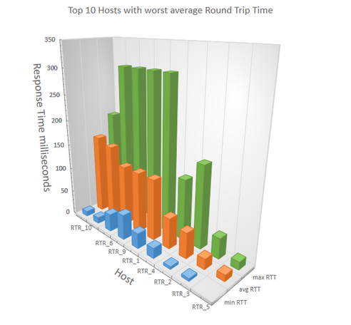
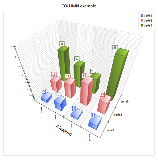
| chart.PerspectivePercent | Enable or Disable perspective of 3D chart 0 Disable |
|||||||||||||||||||||||||||||||||||||||||||||||||||||||||||||
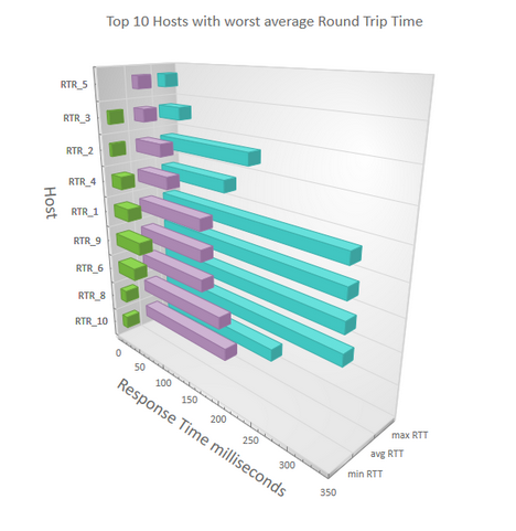
| chart.SwapAxesDirection | 0 - Y axis horizontal and Y vertical axis 1 - Y axis horizontal and X vertical axis |
|||||||||||||||||||||||||||||||||||||||||||||||||||||||||||||
| chart.Scale | Zoom in % for 3D scene | |||||||||||||||||||||||||||||||||||||||||||||||||||||||||||||
| chart.Transparency | Transparency of the series in a 3D chart in percent (100 % is transparent) example with value 50 |
|||||||||||||||||||||||||||||||||||||||||||||||||||||||||||||
| chart.ThemeOpacity | This method sets theme opacity (opacity of fill series colors). dblOpacity should be in range [0, 1]. |
|||||||||||||||||||||||||||||||||||||||||||||||||||||||||||||
| chart.ShowWalls=0; | Displays background walls in 3D scene | |||||||||||||||||||||||||||||||||||||||||||||||||||||||||||||
A Legend displays a list of series names or data points along with their keys. A Legend may be aligned at the left, top, right, bottom and top-right positions of the Chart Area. It may also overlap the Plot Area.
| chart.ShowDataLabels | 0 - Do not display the label of the series 1 Display the label of the series |
| chart.DataLabelContent | Set the informations displayed in the label attached to a DataPoint example : 0: DEFAULT_CONTENT |
| chart.DataLabelPosition | Position of the label of the DataPoint - available for BAR chart and COLUMN chart in 2D and 3D 0 - default |
| chart.DataLabelAngle | Rotation of the label of the DataPoints - Only for BAR and COLUMN chart in 2D and 3D -90 |
| chart.ShowDataMarkers | 0 - Do not display the Markers |
| chart.MarkerShape | 1 - Circle |
| chart.MarkerSize | Size of the Markers |
chart.SeeXAxis |
0 - Do not display the X axis |
| chart.SeeXAxisGridLines |
0 - Do not display the the grid of the X axis |
| chart.SeeXAxisName |
0 - Do not display the legend of X axis |
| chart.SeeXIntervalInterlasing |
0 - Uniform color rear bands |
| chart.XAxisName |
The legend text of the X axis |
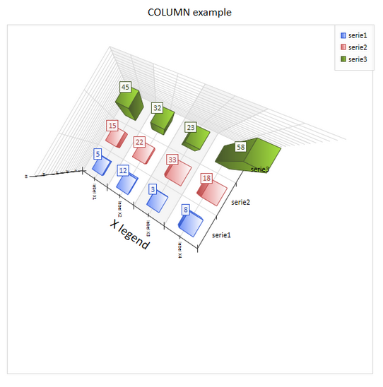
| chart.XRotation |
In 3D rotation around the X axis in degrees. |
| chart.pAxisX_Manage |
0 - Disable all the the following features |
| chart.pAxisX_m_axisLabelsFormat_SetColor |
Color of the labels of the X axis |
| chart.pAxisX_m_axisLabelsFormat_SetDrawingAngle |
X rotation - the angle between X axis and vertical axis in range [0 - 360] degrees -90 |
| chart.pAxisX_m_axisLabelsFormat_SetFontSize |
Size of the font in pixel |
| chart.pAxisX_m_axisLabelsFormat_SetTextAlignment |
0 - DEFAULT 1 - LEADING 2 - TRAILING 3 - CENTER |
| chart.pAxisX_m_axisLabelsFormat_SetTextVerticalAlignment |
0 - DEFAULT |
| chart.pAxisX_ReverseOrder |
0 - Display the serie from left to right 1 - Display the serie from right to left |
| chart.pAxisX_SetAutoDisplayRange |
Automatic and Manual Scaling. In this mode the chart is not zoomed and minimal and maximum displayed values are calculated automatically based on the diagram area size and minimum and maximum values on axes. |
| chart.pAxisX_SetAutoIntervalWidth |
In this mode the size of major units in pixels is calculated automatically, based on diagram area size (axis size) and current scroll range (minimum and maximum displayed values). |
| chart.pAxisX_SetDisplayDataBetweenTickMarks |
This mode can be turned on if the series X component is missing and/or automatically treated as a category index. In this case X coordinates of data points are "shifted" right on half major unit size. This mode is a default for Column and Bar series. |
| chart.pAxisX_SetScrollRange1 |
set a scroll range for an axis. By default scroll range is set to minimum and maximum possible displayed values for an axis. |
| chart.pAxisX_SetScrollRange2 |
set a scroll range for an axis. By default scroll range is set to minimum and maximum possible displayed values for an axis. |
| chart.pAxisX_ShowMajorGridLines |
0 - Do not display the major grid lines 1 - Display the major grid lines |
| chart.pAxisX_ShowMinorGridLines |
0 - Do not display the minor grid lines 1 - Display the minor grid lines |
| chart.pAxisX_ShowScrollBar1 |
0 - Do not display the scroll bar 1 |
| chart.pAxisX_ShowScrollBar2 | 0 - Do not display the scroll bar 2 1 - Display the scroll bar 2 |
| chart.SeeYAxis |
0 - Do not display the Y axis |
||||||
| chart.SeeYAxisGridLines |
0 - Do not display the the grid of the Y axis |
||||||
| chart.SeeYAxisName |
0 - Do not display the legend of Y axis |
||||||
| chart.SeeYIntervalInterlasing |
0 - Uniform color rear bands
|
||||||
| chart.YAxisName |
The legend text of the Y axis | ||||||
| chart.YRotation |
In 3D rotation around the Y axis in degrees. example:
|
||||||
| chart.pAxisY_Manage |
0 - Disable all the the following features |
||||||
| chart.pAxisY_m_axisLabelsFormat_SetColor |
Color of the labels of the Y axis | ||||||
| chart.pAxisY_m_axisLabelsFormat_SetDrawingAngle |
Y rotation - the angle between Y axis and vertical axis in range [0 - 360] degrees -90 |
||||||
| chart.pAxisY_m_axisLabelsFormat_SetFontSize |
Size of the font in pixel | ||||||
| chart.pAxisY_m_axisLabelsFormat_SetTextAlignment |
0 - DEFAULT 1 - LEADING 2 - TRAILING 3 - CENTER |
||||||
| chart.pAxisY_m_axisLabelsFormat_SetTextVerticalAlignment |
0 - DEFAULT |
||||||
| chart.pAxisY_ReverseOrder |
0 - Display the serie from left to right 1 - Display the serie from right to left |
||||||
| chart.pAxisY_SetAutoDisplayRange |
Automatic and Manual Scaling. In this mode the chart is not zoomed and minimal and maximum displayed values are calculated automatically based on the diagram area size and minimum and maximum values on axes. | ||||||
| chart.pAxisY_SetAutoIntervalWidth |
In this mode the size of major units in pixels is calculated automatically, based on diagram area size (axis size) and current scroll range (minimum and maximum displayed values). | ||||||
| chart.pAxisY_SetDisplayDataBetweenTickMarks |
This mode can be turned on if the series X component is missing and/or automatically treated as a category index. In this case X coordinates of data points are "shifted" right on half major unit size. This mode is a default for Column and Bar series. | ||||||
| chart.pAxisY_SetScrollRange1 |
set a scroll range for an axis. By default scroll range is set to minimum and maximum possible displayed values for an axis. | ||||||
| chart.pAxisY_SetScrollRange2 |
set a scroll range for an axis. By default scroll range is set to minimum and maximum possible displayed values for an axis. | ||||||
| chart.pAxisY_ShowMajorGridLines |
0 - Do not display the major grid lines 1 - Display the major grid lines |
||||||
| chart.pAxisY_ShowMinorGridLines |
0 - Do not display the minor grid lines 1 - Display the minor grid lines |
||||||
| chart.pAxisY_ShowScrollBar1 |
0 - Do not display the scroll bar 1 |
||||||
| chart.pAxisY_ShowScrollBar2 | 0 - Do not display the scroll bar 2 1 - Display the scroll bar 2 |
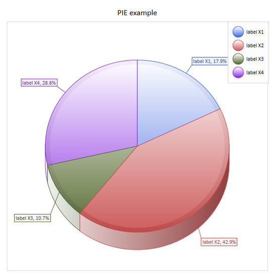
Specific parameters for the PIE chart
| chart.FitDiagramArea=1; | If this feature is enabled, pie shape is drawn as ellipse; otherwise the radius of pie is calculated as a minimum between width and height of diagram. 0 - Disable |
|||||
| chart.PerspectivePercent | The perspective in percent for the PIE in 3D | |||||
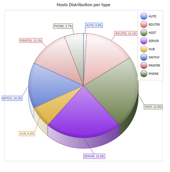
| chart.ExplodePie | Affiche les portions séparément -- 0 FALSE |
|
||||
Specific parameters for the DOUGHNUT and TORUS chart
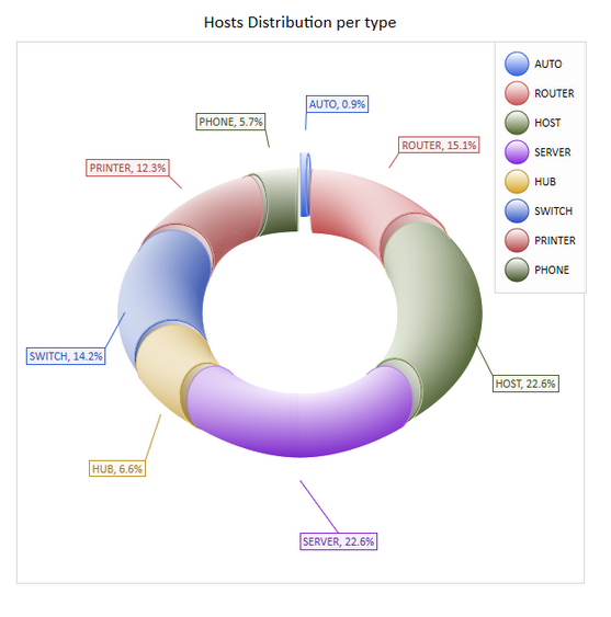
| chart.HoleSize | Valeur en pourcent de la taille du trou central Exemple avec 50 %
|
Specific parameters for the LINE chart
| chart.Feature | -- 13 BCGP_Line |
 |
| -- 14 BCGP_StackedLine | Lignes empilées avec valeur réelle
|
|
| -- 15 BCGP_StackedLine100 | Lignes empilées avec valeur en % | |
| -- 16 BCGP_StackedLineSpline |  |
|
| -- 17 StepLine |  |
|
| chart.LineStyle | Style of the line 0 - solid |
|
| chart.LineThickness | Thickness of the line in 3D charts. Below example with value 20
|
|
| chart.LineWidth | Thickness of the line in 2D charts | |
Specific parameters for the: BAR, COLUMN chart
| chart.Type | Parameter for chart of category BAR, BAR 3D, COLUMN,COLUMN 3D. Must be different from 0 0: BCGP_CT_DEFAULT |
|
| chart.NeckHeightPerc | Specify neck height in percents from the funnel height. |
| chart.NeckHeightType | Interpret the neck height as a chart value. All data points whose values all in range [0, dblValue] will be displayed in the neck. dblValue |
|